
Hi folks,
I’m currently continuing the work you saw in the last update – building a library of time-lapse assets and tools. So far I have posters, aging tiled walls where the tiles break and fall out over time, security cameras, a guard tower, and various types of ‘wirey’ messes, like the stuff that is tucked away under the platform (but is visible in shots) and the wires feeding into lights, etc. I’m currently working on integration and interaction: creating tools to easily put them into shots, and methods they can ‘talk’ to each other, so that, e.g. a falling tile rips out the posters in front of it. All of these result in ‘normal’ blender animation curves, even though many are using animation nodes to build.
In the meantime, I’d like to show some earlier work we did, namely, our imaginary language/font we’re going to use in the film:
Early on we decided the film would be wordless – no written or spoken words – and we would rely on images, shots and animation rather than language.
Our location is everywhere and nowhere – but it still needed diagetic written words: signs, advertisements, propaganda, etc. Not as language but as texture.
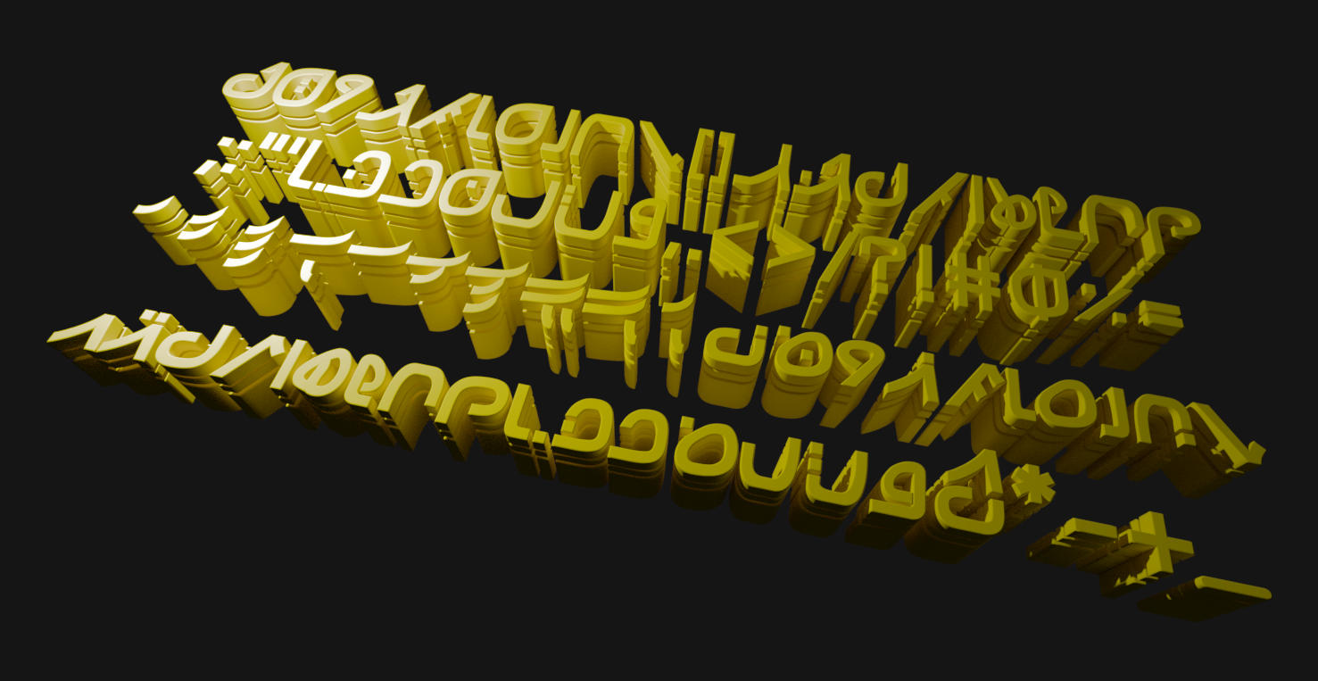
We want the dream to be universal – inspired by specific events, specific places, and deeply colored by them, but not speaking ‘only’ to one group of people. So instead of betraying that desire by using a specific language, it became more obvious that we should use a unique typeface with glyphs that don’t really correspond to an existing script. Since our film is based on the epic of Gilgamesh, we thought it fitting to imagine a modern Sumerian language, evolved from ancient writing over thousands of years to the point of unrecognizability.
Initially I came up with some rough designs, mostly jokey references to 3D graphics elements (axis, cursors, rotation icons, nodes, etc.) mixed in with slightly corrupted versions of letters in English and Arabic, languages that I understand. Last summer, one of our interns further made several quick variations on those ideas, experimenting further.
I spoke with a number of well known font experts in the free software world, and one of them advised me to avoid the following:
- Difficult to read or write symbols, as those would give the feeling of an ‘alien’ font
- Symbols too close to existing letters
- Joined scripts as those are tricky to make work
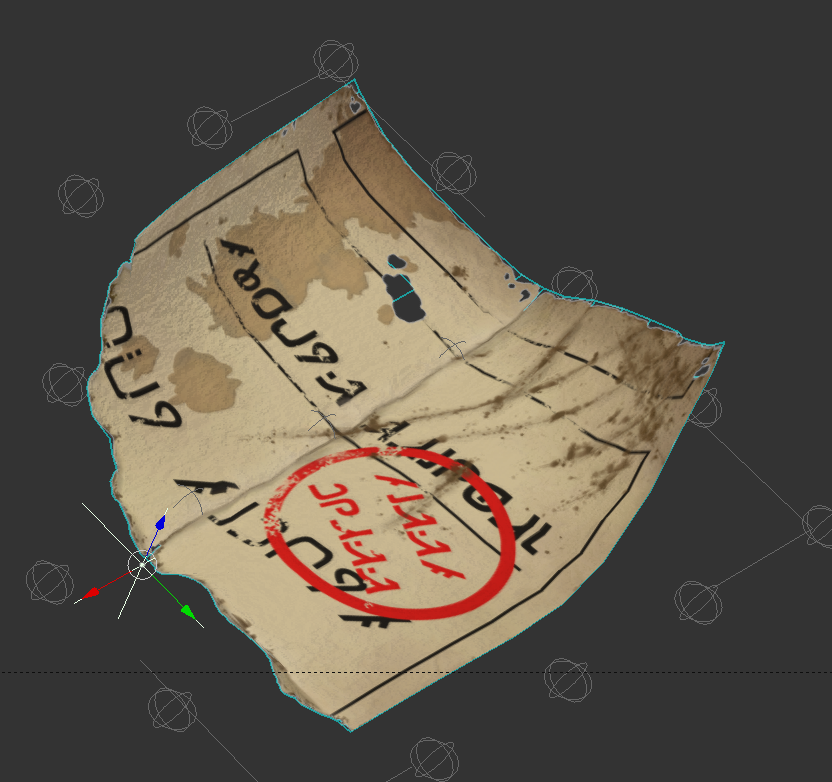
As a result, I went back to square one (or is it zero) and tried to come up with a design that worked better with those restrictions. The result is a typeface I’m calling “Soomerian Modern” that we can use with Blender, Inkscape, Krita or Gimp to make our various 2D elements. The first instance of this is on a train ticket, visible torn on the ground in the first shot.
Look forward to stencil and other variations of the font, and to seeing it appear on the poster assets I’m now coding/noding 🙂